Component
The component carries the core function of the configuration editor and is the basic element of the configuration editor. Drag the required element to the canvas of the selected page, and then configure the data source, interaction, display style, etc. of the element to use the function of the element.
General Operation#
Add components to the canvas#
Select the text component from the left component, hold down the left mouse button, drag it to the configuration design canvas, release the left mouse button, and the component will be displayed on the screen.
Adjust component size and position#
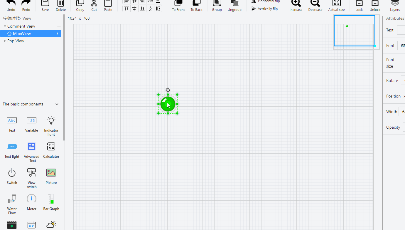
Change the size: click on the component with the mouse, and then move the mouse to the small rectangular box with dots around the text component. When the mouse arrow changes to a direction arrow, press the left mouse button and drag it to change the size of the component .
Change position: When the mouse changes to a double "cross" on the component, press the left mouse button and drag it to change the position of the component. Note: If the size of the component is set too small, it will affect the display effect.
Adjust component direction#
Change direction: click on the component with the mouse, a small rectangle with dots around the text component, and a small rotating icon will appear. Place the mouse on the selected small icon. At this time, when the mouse changes to a double "cross" font, hold down the left mouse button and drag to change the direction of the component.
Basic Operation#
The basic operations of components include copy, paste, cut, left-align, center-align, right-align, top-align, center-align, bottom-align, top-to-bottom, zoom, and group operations. For details, please refer to the toolbar introduction above.
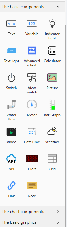
Basic Components#
Text#
Used to express and display the specified content.
The text does not support interactive mode and data binding.In the style configuration, it is supported to configure the title, position, size, angle, text font, font size, color, alignment, bold, slant, underline, and background color of the component.
Variable value#
The variable value component uses the data of the bound variable as a dynamic data source to display the value or configuration content.
In the style configuration, you can configure the title, position, size, angle, text font, font size, color, bold, slanted, underline, and background color of the component.
Double-click the variable value component in the canvas, data binding and other interactive settings can be performed in the pop-up dialog box.
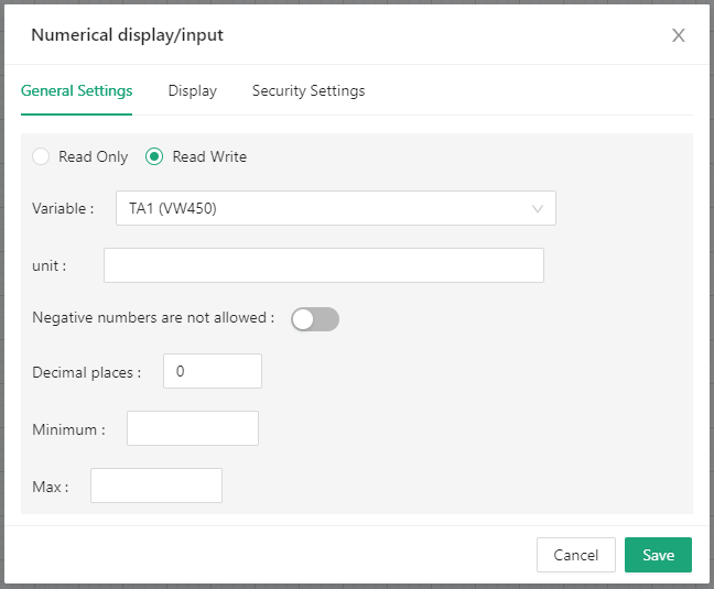
General settings
Read-only/read-write: When “read-only” is selected, the variable is read-only and the value cannot be changed; when “read-write” is selected, the value can be modified.
Variable name: This field is used to bind the data of the component, drop-down selection.
Unit: When a unit is filled, it will be displayed after the value.
Negative numbers are not allowed: After opening, if the read variable value is negative, it will be displayed as 0.
Decimal places: Shows the number of decimal places.
note
The data binding of all components is set on the "General Settings" tab.
Explicit and implicit settings
Can set the display conditions of the component.
Security Settings

When the variable is "read-write", this option is available; when the variable is set to "read-only", this option is unavailable.
After the password control is enabled, the set password is required before operating this component. If the password is incorrect, the operation cannot be performed.
Current control component password: single selection, after selecting a certain password, you need to enter the corresponding password to operate this component.
Image indicator#
The image indicator element displays different pictures when the data of the bound variable meets different conditions.
General settings
Bind the data of the component.
State
Different states can be set according to different conditions.
Graphics
Different graphics can be selected here.
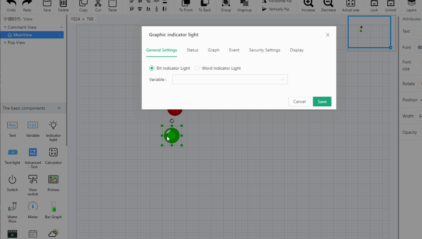
Create graphics
Can also upload your own graphics here. The number of your own graphics should be uploaded according to the actual number of variables bound to the component, and at least two images should be uploaded.
Event
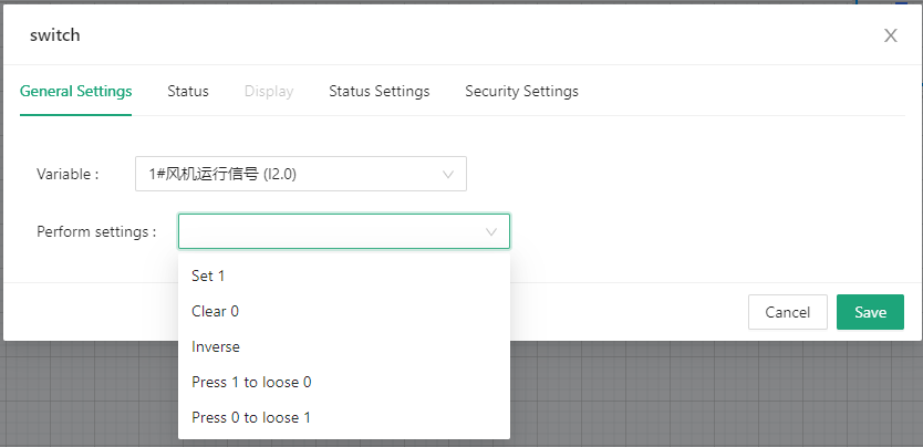
The event triggered when the component is clicked.
Variable name: The name of the variable bound to this event.
Execution setting: the action executed by the event, here supports 4 actions, set 1, clear 0, invert, press 1 to loose 0, press 0 to loose 1
Text indicator#
The text indicator is to display the values of different states in the form of text.
Advanced text indicator#
The advanced text indicator is to display the values of different states in the form of text. Its condition settings are more abundant than ordinary text indicators.
Calculate#
The calculation element is used to simply calculate the value between variables.
Switch#
The button of the symbol that executes the event.
Screen switching#
Component button for switching the configuration screen.
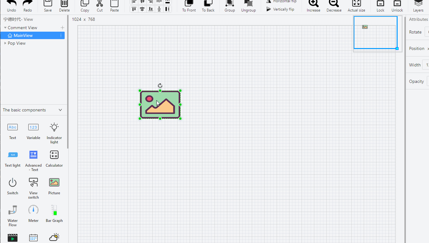
Image#
Image components, the system's built-in gallery, after selecting an image, it supports binding events.
Rectangle/circle/polygon/triangle#
Geometry components can bind variables, and set corresponding state styles according to the bound variables.
Straight line#
Linear components only support style configuration.
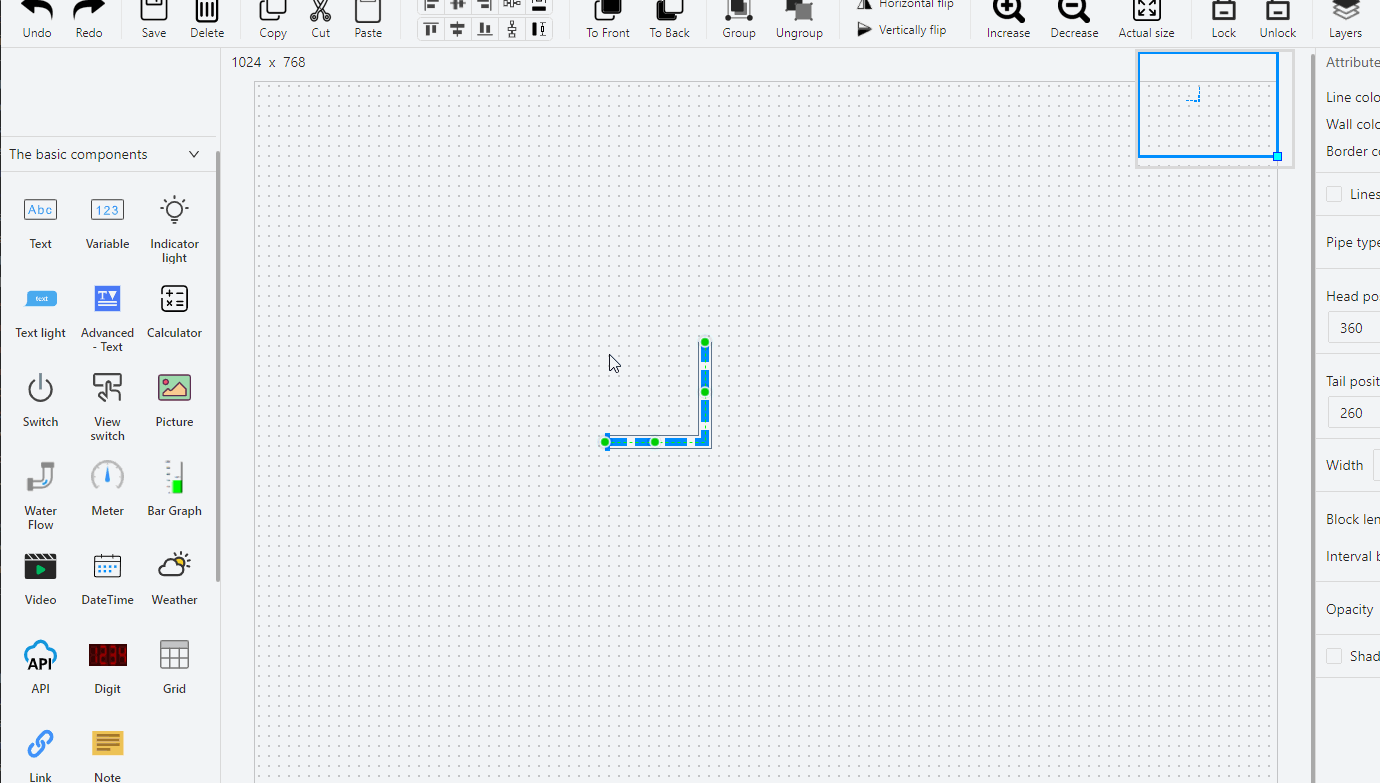
Pipeline#
Pipes or flow strip elements are mainly used to show some effects such as water flow.
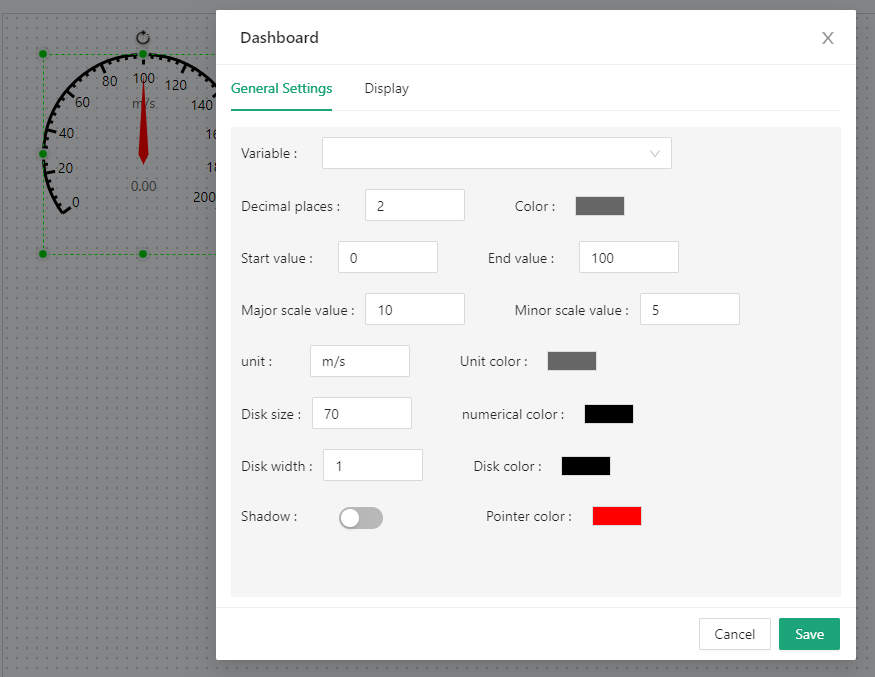
Dash board#
In the data configuration, the title, data source, minimum scale, maximum scale, etc. of the component can be configured.
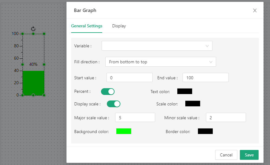
Bar graph#
The bar graph element displays the variable value in the form of a column.
Video#
Video components are mainly used for video playback in the configuration screen. The video source comes from Toolbar> "Settings"> "Video Configuration".
Historical curve#
This component is mainly used to view the trend graph of the historical data of the bound variable.
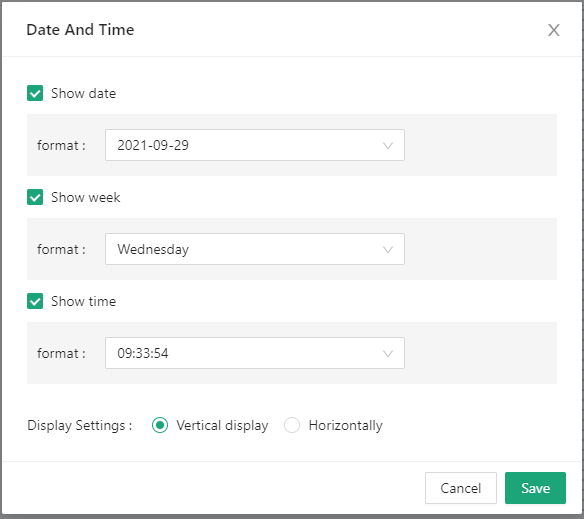
Date and time#
Display the date and time, and the display format has many forms.
Table#
This component displays historical data or historical alarm data in the form of a table.
Weather#
According to the geographic location of the device, the current weather conditions in the area are displayed. You can set the font color and background color.
